UX Research · Tool Design · Neurodivergent UX
SpellStep
A gamified task management app for neurodivergent users — designed to replace guilt with story.
ADHD / AuDHD
success rate
rounds
The Problem
Existing focus apps are built for neurotypical users. For ADHD and AuDHD users, punishment-based streaks and cluttered UIs don't motivate — they cause shame, avoidance, and abandonment.
"I hate starting things, but I can do 15 minutes."
P4 — Interview"I hate cluttered tools."
P5 — Interview"Having class deadlines is the only way I get stuff done."
P3 — InterviewLiterature Review
Task initiation is both a cognitive and emotional problem, so before any interviews happened, three peer-reviewed sources shaped what we tested for and why.
Gamified focus apps (Focus Quest, Forest, Study Bunny) can become the very distraction they're meant to prevent — the mechanic itself competes for attention.
Gamification only motivates when it makes users feel capable and in control. When it reads as pressure, points and badges actively demotivate — simple feedback outperforms heavy reward systems for users who get easily overwhelmed.
Chess-based training games for ADHD teens didn't improve executive function overall, but did measurably help emotional regulation and attention — evidence that simple, structured mechanics can help without adding stress.
This is why the research combined literature, interviews, and testing rather than leaning on any single method: no one source could capture both the cognitive and emotional sides of task initiation on its own.
User Research
5 semi-structured interviews with ADHD and AuDHD students. Sessions included app walkthroughs and post-task emotional reflection. Insights were synthesized via affinity diagramming.
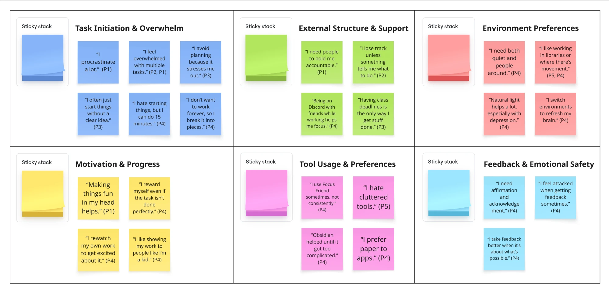
Affinity diagram — 6 themes across 5 participants
Participants procrastinated not out of laziness but confusion about the first step. The barrier was initiation, not motivation.
All participants preferred people over apps for accountability. No existing tool felt emotionally safe enough to return to after a missed day.
User Personas
Two personas synthesized from interview data — Sharon (the "before" state) and Alex (the "after" — what SpellStep enables).
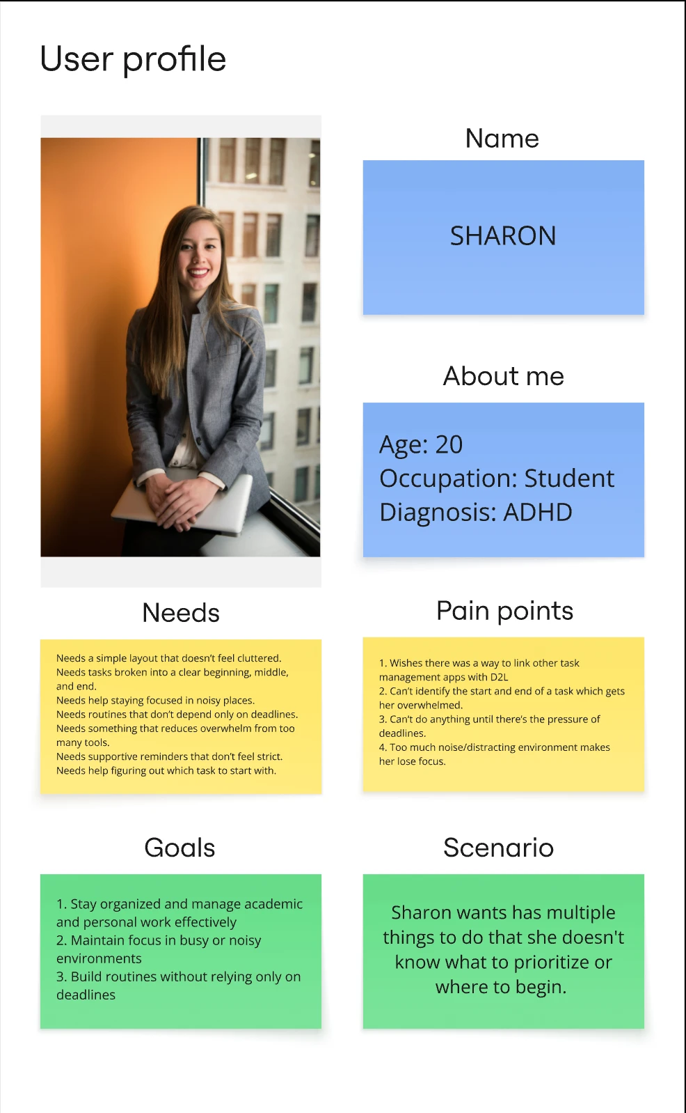
Sharon — overwhelmed, deadline-dependent
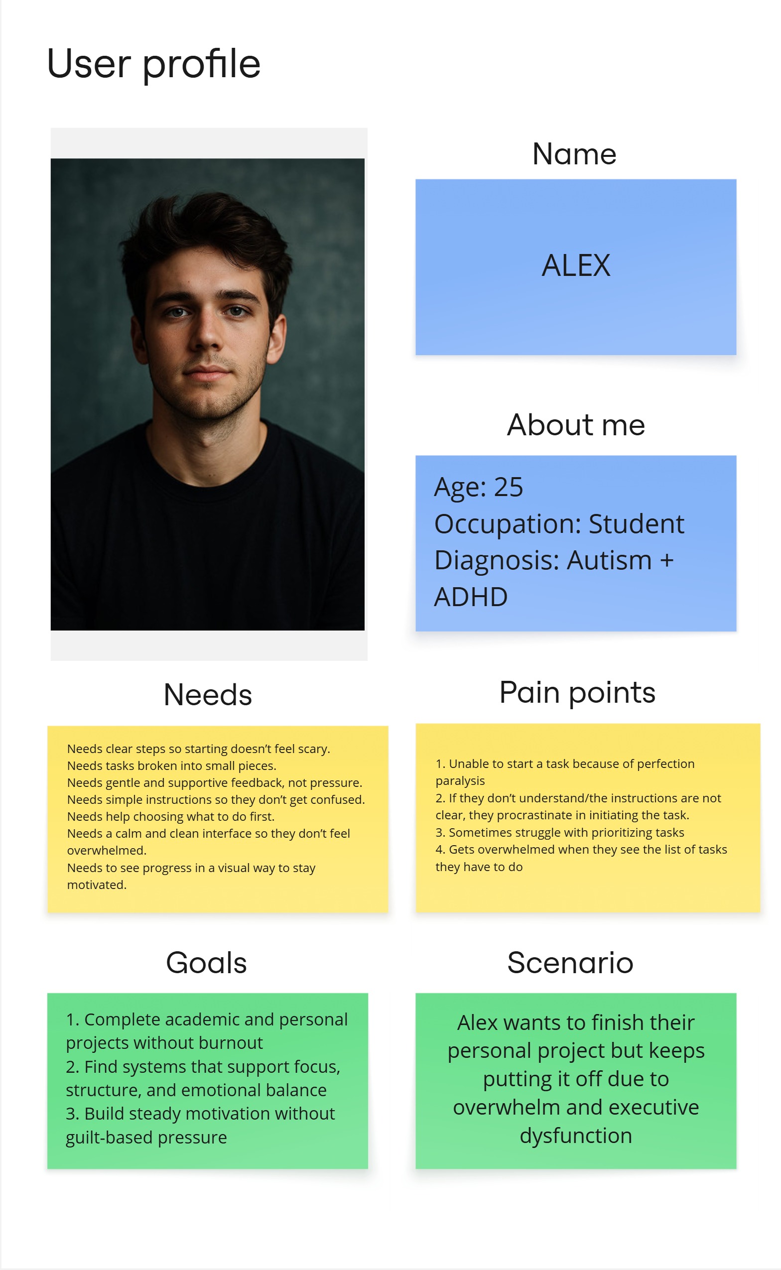
Alex — perfection paralysis, avoidance spiral
Journey Maps
Sharon's journey shows the chaos without SpellStep — task overload, tool-switching, avoidance, deadline panic. Alex's shows how SpellStep intervenes at each emotional low point.
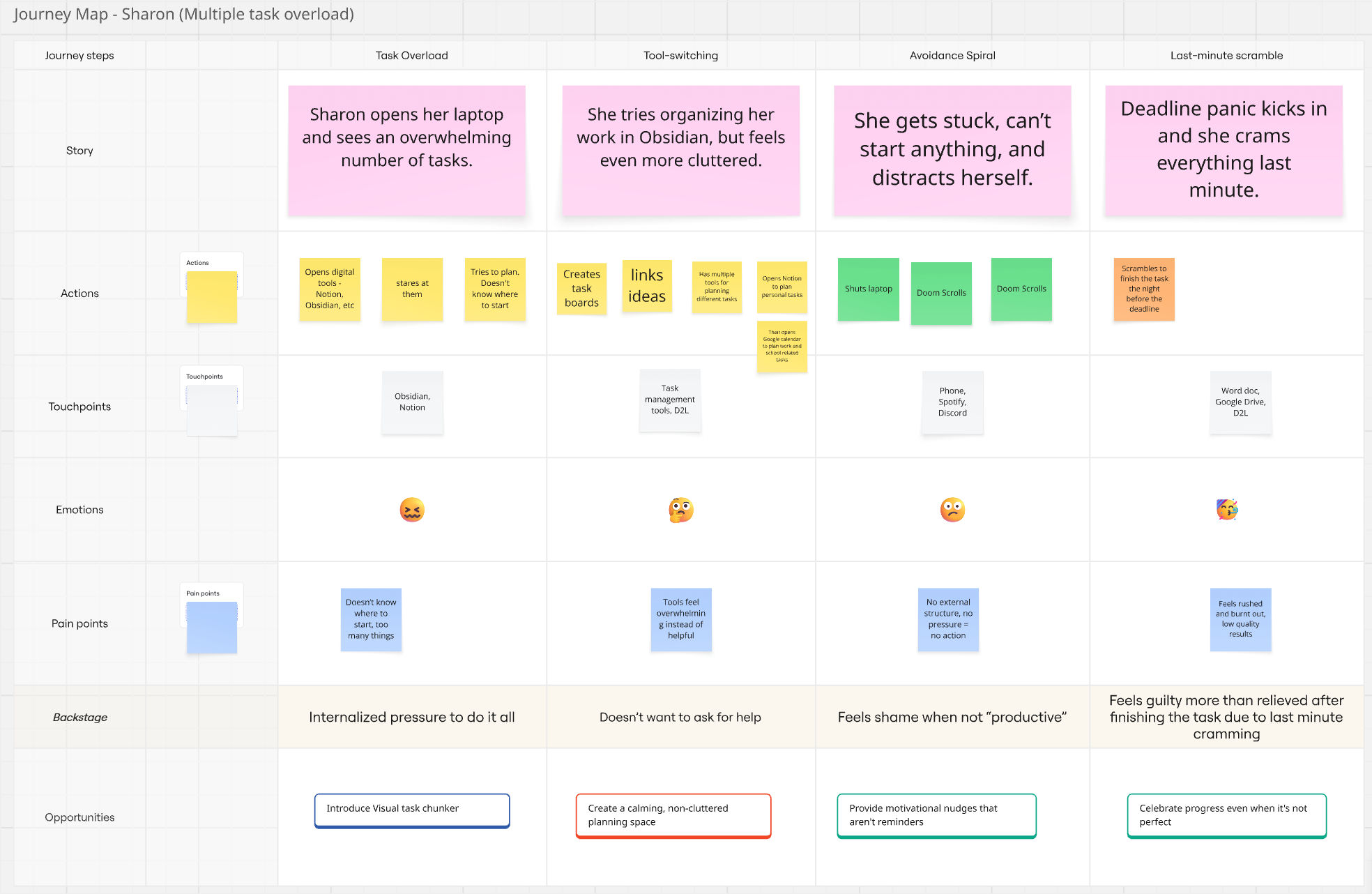
Sharon — Task Overload → Tool-switching → Avoidance → Last-minute Scramble
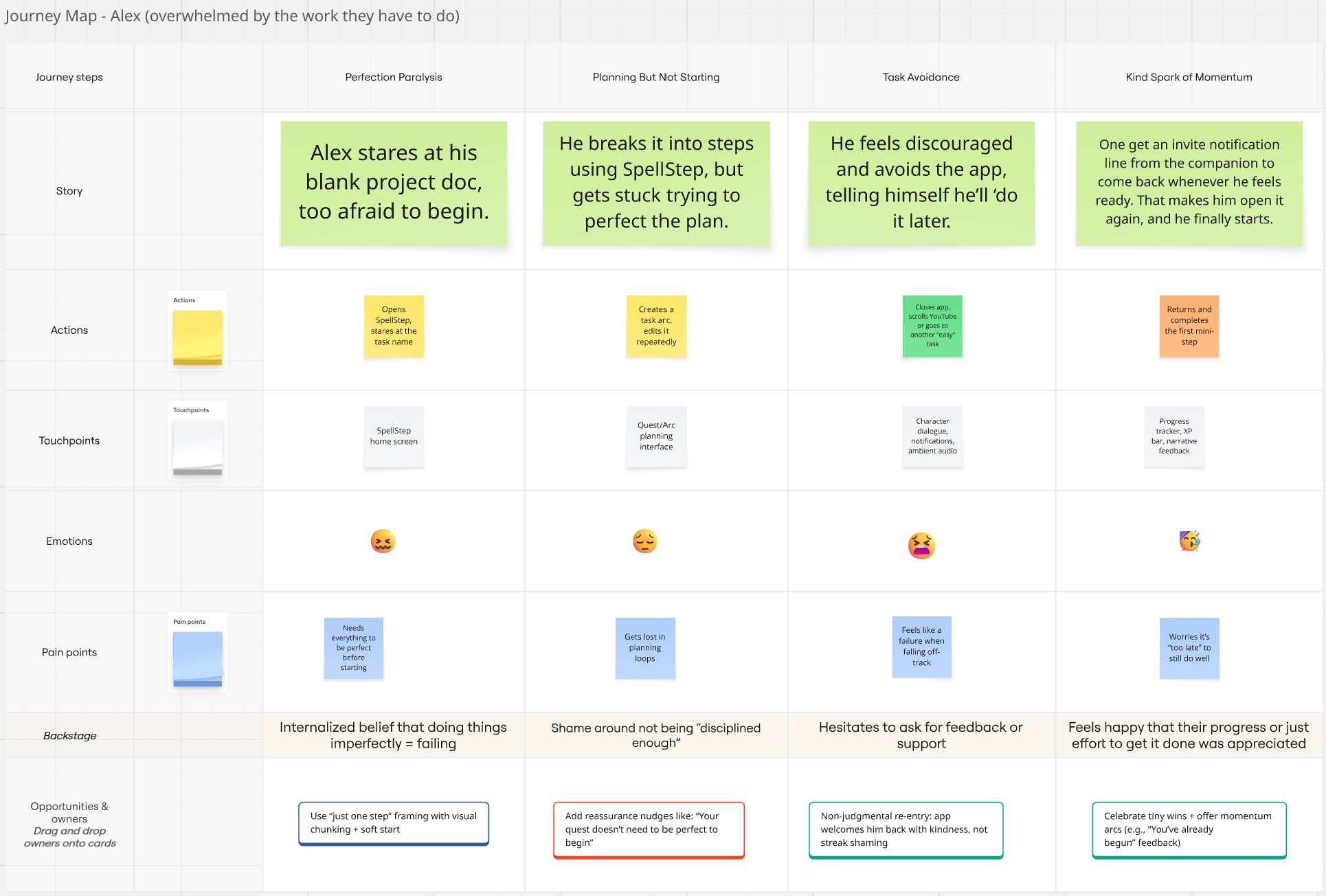
Alex — Perfection Paralysis → Planning Loop → Avoidance → Kind Spark of Momentum
Additional Methods
Beyond interviews and journey mapping, the research included competitive analysis, IA testing, and two rounds of prototype validation.
Evaluated Forest and Focus Quest using UI Tenets & Trap Cards. Forest's plant-death mechanic caused genuine guilt. Focus Quest's rewards felt irrelevant to actual work.
86.25% success rate, but directness dropped to 67.5%. Task 10 (edit companion personality) failed at 37% — narrative labels confused users without visual support.
24 cards, remote participants. Structural features (steps, timers, goals) had 78–92% agreement. Emotional support features scored 12–25% — users had no shared mental model for them.
Round 1 (1 participant) exposed missing pet icons and a confusing duplicate button. Round 2 (3 participants) confirmed fixes — and revealed "Decide for Me" had 0% comprehension.
Design Decisions
Every feature traces back to a specific research finding.
- Task chunking into "spell steps" — interviews: users were stuck on the first step, not unmotivated
- No punishment for inactivity — SDT literature + Forest testing: guilt mechanics caused abandonment in ND users
- Plain-language emotional labels — card sort: emotional support features scored lowest (12–25% agreement) — users needed simpler, more predictable naming
- Ambient companion over dialogue popups — prototype Round 2: intrusive dialogue was "annoying rather than motivating"
- "Decide for Me" removed — prototype Round 2: 0% comprehension across 3 participants
- Visual progress map — card sort: "progress" had no consistent mental model; narrative framing made it emotionally legible
Reflection
What I'd do differently: run the tree test earlier. We caught IA problems through it, but only after some early design decisions were already emotionally "sunk cost" for the team. Testing structure before visual design would have saved a revision cycle.
Key Learnings
- Emotional features are the hardest to name — structural labels are intuitive; tone-based features need plain language and visual anchors
- Rapid 1-participant testing reveals the biggest issues fastest — Round 1 exposed the pet and icon problems before they compounded
- Punishment-avoidance is a design requirement for ND users — not a nice-to-have. Guilt mechanics don't motivate; they cause abandonment
- Card sort user labels are better than team-invented ones — "Getting Started" and "Mini-Steps" came from participants, not us